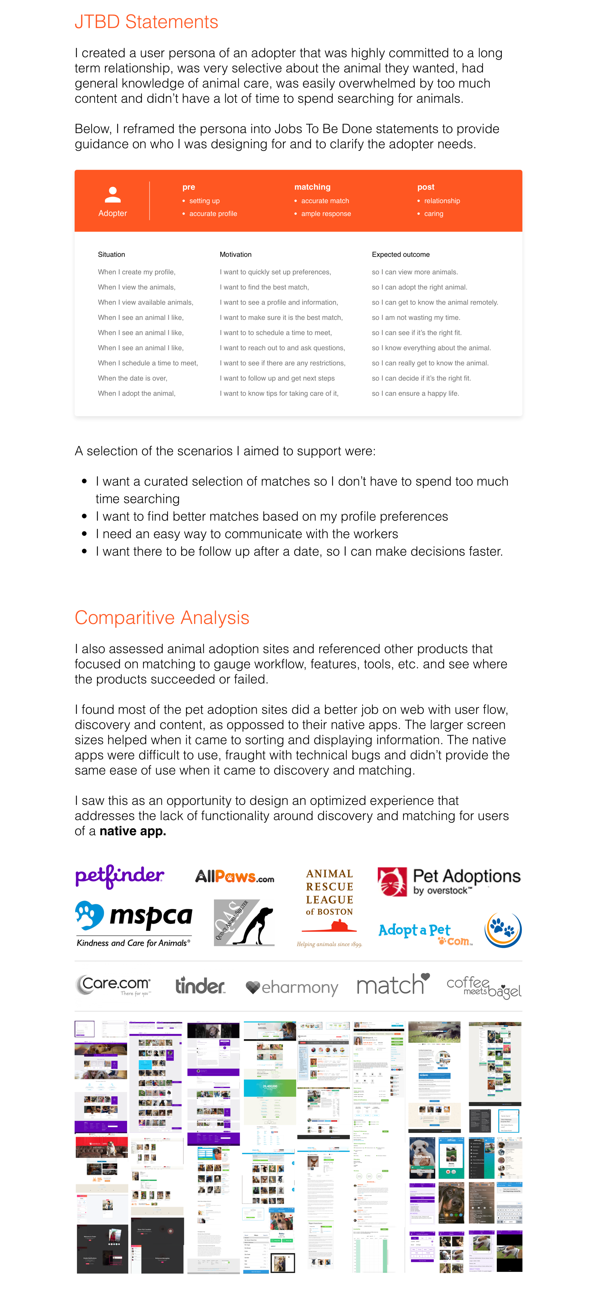
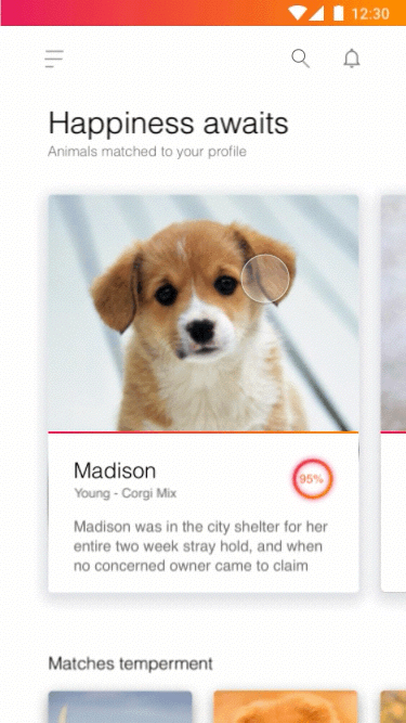
Opening.png
UserJourney.png
Defining the user.png
rose chart.gif
JTBD page.png
Design principle.png
Ideation.png
Discovery Title.png
 

List View

Pro: Can combine photos with descriptive text with limited space.

Con: Difficult to see details in small photos and text is somewhat nominal.

list.gif
 

Card Scroll

Pro: Big animal photos with descriptions are very engaging.

Con: Only viewing one animal at a time could be tedious for people.

scroll_shrink.gif

Grid View

Pro: Emphasis on maximizing a lot of animal photos on one screen.

Con: Potentially sacrifice some text descriptions for larger images.

grid list.gif
 

Card Swipe

Pro: Limit text in favor of images so people can quickly view more. 

Con: Viewing a lot quickly might not best address ideal users needs.

swipe.gif
 
Wireflows.png


Final Outcome

Below are the final designs aimed at solving the user needs from the research. 

The final designs seek to improve in four key areas:  profile, discovery, matching and feedback. 


Perfect Match

Accurate profile matching for compatibility

The set up wizard helps onboard users to the app but more importantly, generates a profile of the user based off their preferences of animal, behavior, breed, location, special requirements, etc. This information is used to help match the adopter and animal once set up is complete.


profile.gif
Profile 2 screen.png
 

Intimate Findings

Targeted discovery for a refined search experience

The home screen utilizes a card layout and features animals that best match the preferences of the user. The best matches are highlighted with larger images, descriptions and include profile match scores. The sub sections are curated to match at least one user input and allows for targeted exploration in case there isn't a perfect match up top in the featured section. 

 
Browse Screen.png
 
home scroll.gif


Action Centric

Easy access to messaging and educational outlets

Once users drill-in on a selected animal, they can take any number of actions to get more details. They can find out more information about the animal, read their story, find out where they are located, share, favorite, message, call and schedule dates to meet the animal. 


browse detail.gif
Fab Screen.png
 

Feedback Loop

Inclusive post date feedback to improve the matching experience. 

Finding the right partner is a fluid process and doesn't always work the way it's initially intended. Users get a chance to provide post date feedback regardless of how things went. Responses help to expedite next steps whether it's moving forward with adopting, seeing more animals or providing helpful feedback.

 
post screen.png
 
post date.gif


Recap

I tried to design a system that focused on meaningful matching by having users input their preferences early during set up. The assumption is that users would find this tool more rewarding because they won't have to sift through loads of filters later. Also, because animals are being matched to user profiles, there's a chance the animals could find them, instead of vice versa. 

I'd also like to validate whether users prefer more or less content on an initial screen and if it's preferable to have more photos or descriptions for details. Below are some UI designs that were not selected but I'd be interested to gauge user reactions of preference and flow. 

 
conceptimages.png
 
 
pet adoption logo shadow.png
 

Thank you for viewing!