OpenCity
OpenCity is a customer communication tool that helps connect restaurants with patrons through a multi channel Customer Relationship Management product.
OpenCity offers a live chat widget to be placed onto websites for communication, so restaurants can respond to customers on any device.
PROJECT OVERVIEW
OpenCity raised seed funding and wanted to improve their outbound and inbound marketing efforts. The initial ask from the founder was to redesign their web page as a sales and marketing tool to capture leads of people who visited the OpenCity site.
MY ROLE
I was hired as a design consultant to deliver all UX related work. I was the sole UX resource responsible for the experience strategy, design, research, testing, and I also took on a PM role to define priorities and roadmap.
I worked closely with the founding team (founder, chief engineer and lead engineer) within an aggressive 30 day period to deliver all designs and assets for build.
APPROACH
I created a waterfall schedule to detail my 30 day engagement, but within those 30 days, I took a lean UX approach. I constantly iterated, tested, and talked with customers to validate assumptions and designs.
Getting the UX correct early in the process was crucial for the success of the project. I wanted to gather as much information as possible, so I decided to organize a 2 day Design Sprint with the founders and existing users that focused on the Empathy and Define phase of the design process. This helped me quickly understand the problems and needs of both the users and founders.

DESIGN SPRINT OBJECTIVES
The objective of the Design Sprint was to get clarity on the users, problems/needs, prioritize roadmap and define what success looked like. A total of 8 people, including myself, participated in the 2 day sprint consisting of the founding members (3) and current users of the product (3).
I facilitated the event by conducting stakeholder interviews, user inquires and mapping out a user journey to better understand the user(s). Next, we referenced print outs of competitors for inspiration and discussed what worked well or not, during the comparitive analysis phase. I then facilitated exercises to start to define users by creating Jobs To Be Done and How Might We statements to think about constraints. Next, we looked at the identified opportunities and began to evaluate what we thought were the biggest priorities. Lastly, based on those priorities, we discussed what success looked like from a user and business perspective.


CURRENT PROCESS & OPPORTUNITY
A major point of discussion from the Design Sprint was how OpenCity currently acquires customers.
OpenCity uses a sales rep to reach out to local restaurant owners by cold calling them and talking about the benefits of OpenCity. After, they meet in person and discuss how OpenCity works by showing the owner a demonstration of Opencity. The in-person demonstration requires a line of code to be installed on the owners website so they can see what the OpenCity chat icon looks like on their site and how customers will interact with.
We wanted to replicate that in-person demo by creating a digital version that owners could interact with on the OpenCity website. We believed this would improve the in-bound conversion, which currently did not exist.

USER AND SCENARIO
Two user types emerged from the Design Sprint, the merchant and patron. The merchant is a restaurant owner or general manager of night clubs and the patron is the customer who reaches out to the restaurant or night club.
We decided to focus on the restaurant owner because they were the primary users of the product. We also concluded a lot of the use cases like reserving tables, replying to negative reviews, and texting, etc also supported many of the needs of the general manager. We referenced the patron in a supporting role for other areas like communication and timeliness.
While many of the needs of the user were product specific, motivations and behavior were helpful when thinking about the correct marketing messaging.


UX PRIORITIZATION
I worked with the stakeholders to identify what we wanted to complete for launch. We discussed success metrics, assumptions associated with them and ranked them on importance. Importance was defined by user and business needs and considered based on cumulative score.

DESIGN PRINCIPLES
Creating a set of design principles based on the research helped to inform decision making over the duration of the project. I found myself referencing them to stay focused on the major goals that were established earlier.

IDEAL USER FLOW
I mapped out the ideal user flow to help contextualize where in the site might need more or less information. This was helpful when thinking about where users would make a purchase decision in the flow.

CONTENT BLOCKING
I then started to block out basic sections of the page and potential content. It was hypothesized we could take a layered approach to the content which would prompt a user to want to learn more. We believed a funneled navigation scheme would help educate prospective buyers and would have the largest conversion rate of people purchasing.

INITIAL SKETCHES
Early concept sketches focused on trying to get the sign-on process correct and how best to capture visitors information. The biggest internal debate was where the credit card payment section should belong. We explored different methods of trials, freemium, premium options and presented several concepts to be validated by users.

LO-FI MOCKS
Low fidelity mocks were created of the basic content sections within the website. They were used as a card sort and provocation exercise with users. After users explained how they used the site and what they liked/disliked, I then showed the concepts below and had them organize the print outs hierarchically based on what they thought made sense.

MED-FI MOCKS
Creating a digital version of the in-person interview was challenging, but the moment of discovery came when I got to watch how a sales rep placed the line of code onto the owners web site. I tried to incorporate as much of that process as possible and worked with the engineers to create an overlay of the OpenCity chat icon onto owners websites. This mimicked the exact behavior of what the in-person did but in a way that was attainable by any person because all they had to was input their website URL.

ABOVE THE FOLD
Since OpenCity benefits both the merchant and patron, we wanted to appeal to the merchants desire to respond to their customers. The first set of designs focused on showing the merchant the benefit of OpenCity through the customers POV. We believed a strong emotional connection to the customer provided the best opportunity for the merchant to fully grasp what OpenCity does. A lot of the assets, imagery, animation and language were designed to capture those moments above and below the fold.


HI-FI TESTING
After the rounds of iterations, we decided to conduct 5 in-person tests to gauge how non existing OpenCity users reacted to the concepts.
One of the designs was a layered approach in which a user got a summation of OpenCity and if they wanted to learn more, they would click into a section that brought them to a separate page with more detail. The demo was also static and listed out what it did it as an illustration.
Another design was a flat approach, in which the user would see animations within each section to learn more about how the product worked. We also provided a demo so users could simulate the experience of how OpenCity would look on their website.

TEST RESULTS
The results of the usability test were helpful because they validated some previous assumptions but also generated new insights. The biggest take aways were rethinking our initial direction to be more merchant focused, clean the copy and restructure the content hiearchy.

CONTENT STRATEGY
One of the primary points of feedback from users, was that they were confused who the product was being marketed toward. The copy was a key component for the success of the project and we had to get it right. I quickly organized a content strategy brainstorm with the founding team to ensure we had the right messaging.
I facilitated the brainstorm and we were able to narrow down the preferred language that best reflected the product from the merchant perspective.

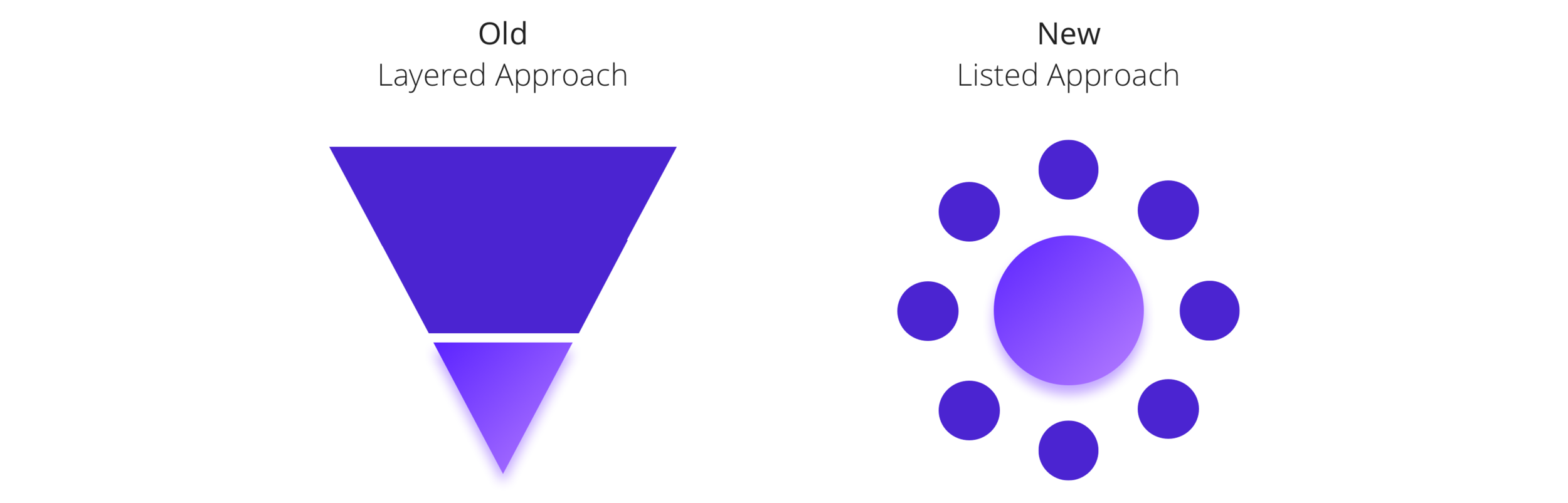
DESIGN PIVOT
Taking the user feedback into consideration, it seemed appropriate to pivot from the initial design hypothesis. I decided to see how much useful information could be provided on the initial web page without it being too overwhelming or long. The decision was made to remove the layers in which users had to click to get more information and instead show the information in bulleted lists.
CONTENT HIERARCHY
With a new design paradigm in place, I placed the information in different hierarchical schemes and tested various content and copy concepts.

VISUAL DESIGN
Finally, after all the UX had been validated with users, I created a lot of visual UI to help with messaging and branding. They ranged from being simple, fun, aspirational, etc. and referenced desires of the founder but also referenced elements we all chose during the initial comparative analysis. A narrowed down selection of designs were hosted on Usability Hub and testers were able to vote on preference of concepts.

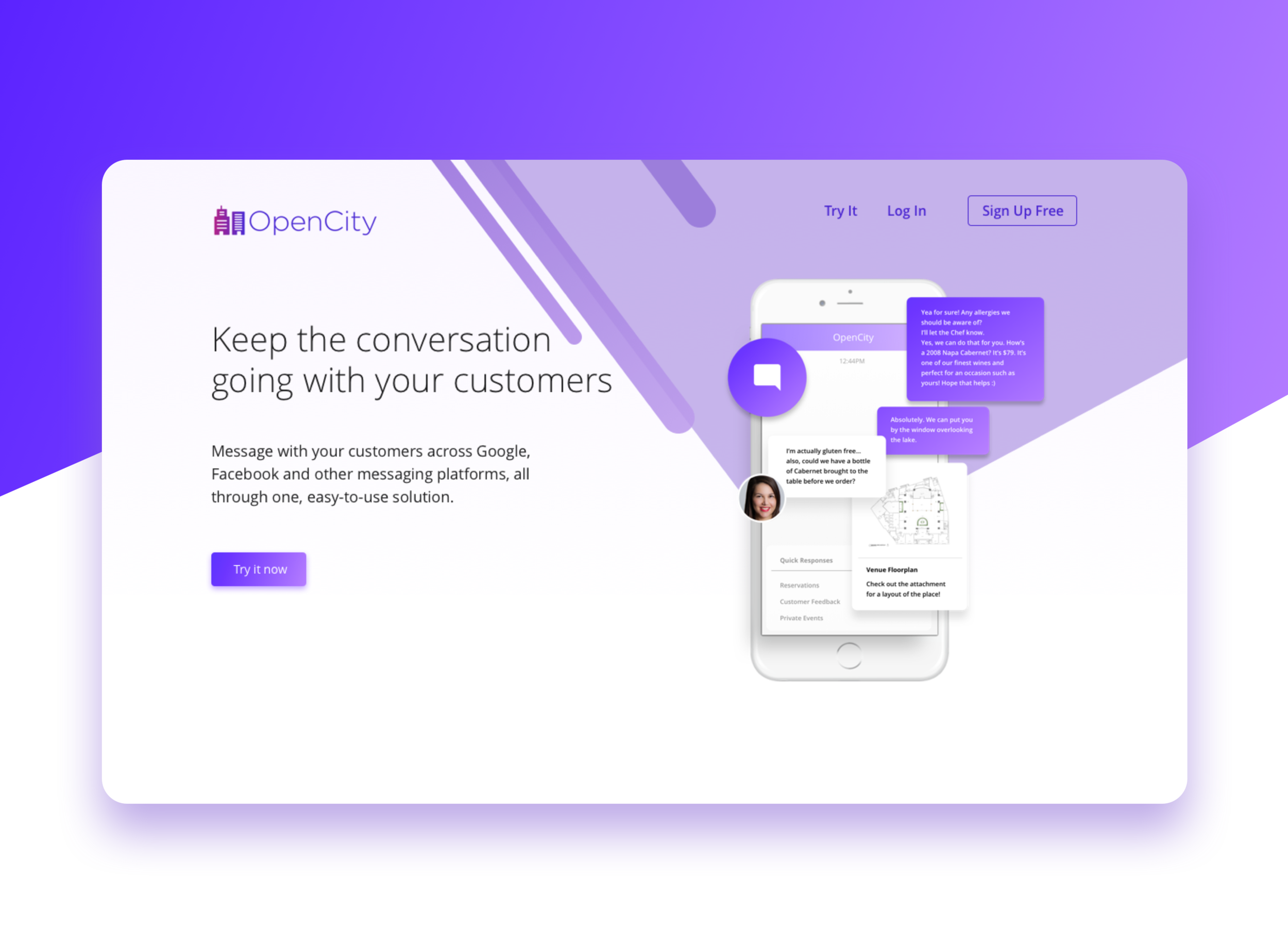
Final Design
The final design emphasizes what OpenCity does by listing out benefits within each section of how it works, discovery, response, managing (CRM), and showing real conversations. Everything can be understood on a surface level with users clicking a bullet point to see a refresh of a section. This way, busy restaurant owners can see the value at first glance but also click to see more if they are interested.

On the surface
Users can scan the webpage and get all the relevant information they need without having to dive deeper into a specific section. If they want to learn more, they can click each tab and see a refresh of each section.

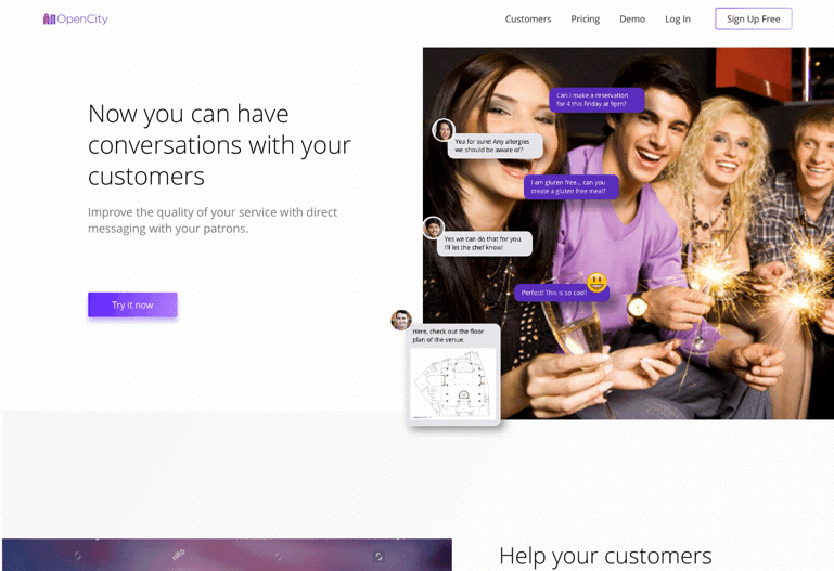
Just like the real thing
The in product demo captures the essence of the in-person demonstration by overlaying OpenCity’s widget on customers websites and they can respond just like if they were using OpenCity.
*** Please click the play button to see a video of the demo***
Simple sign-on
The sign-on experience is a 4 step process that allows the user to create an account, generate a new texting number, choose a plan, and install the code.

Responsibly responsive
OpenCity was designed to be understood by everyone, on any device. The designs have been optimized for web, tablet, and mobile for easy viewing.

Recap
OpenCity gave me a deep appreciation for how fast young start ups move. I had the pleasure working with the founding team to deliver a new experience that the board and investors approved and liked. Overall, I'm happy with the result and with more time, I'd to explore the sign-up flow and relook at the business model of where payment could have gone.
1. Designed and delivered 3 unique UX experiences in 30 days.
2. Facilitated workshops to get quick and deep insights into the problems and goals of the founding members and OpenCity users.
3. Prioritized roadmap and made UX decisions in absence of a PM.
4. Constantly validated with the user by conducting many user research sessions and 4 usability testing sessions.
5. Sole UX resource responsible for all UX from research, content strategy, ideation, wire-framing, prototyping, testing, animation, visual design, pixel perfect production work, and working with engineers to ensure a successful build.
