HOPPER


Hopper provides insightful, data-driven research to help travelers make better decisions about where to go, when to fly and when to buy.

Hopper uses data sets comprising billions of flight prices to help travelers find the right destination for their budget and feel confident they’re getting the best possible deal. Hopper constantly monitors prices to find great deals, and notifies the user the instant they should buy. 

Hopper app screens - February 2016


THE CHALLENGE

Hopper customers became very vocal about the apps lack of features and expressed interest in having more search filters for flights. In some cases, the lack of filters made certain features in the app, like the price prediction and watching, fairly useless to users who had specific preferences.

MY ROLE

Hopper asked if I could develop lo-fi mock-ups and help address the current lack of search filters. Through my exploratory work, I conducted user research, defined design principles, created wife-frames, redesigned the user experience, analyzed/synthesized data and created prototypes for project alignment. Although, the end output was not adopted by Hopper, my process highlights key opportunities for an optimized search experience. 

APPROACH

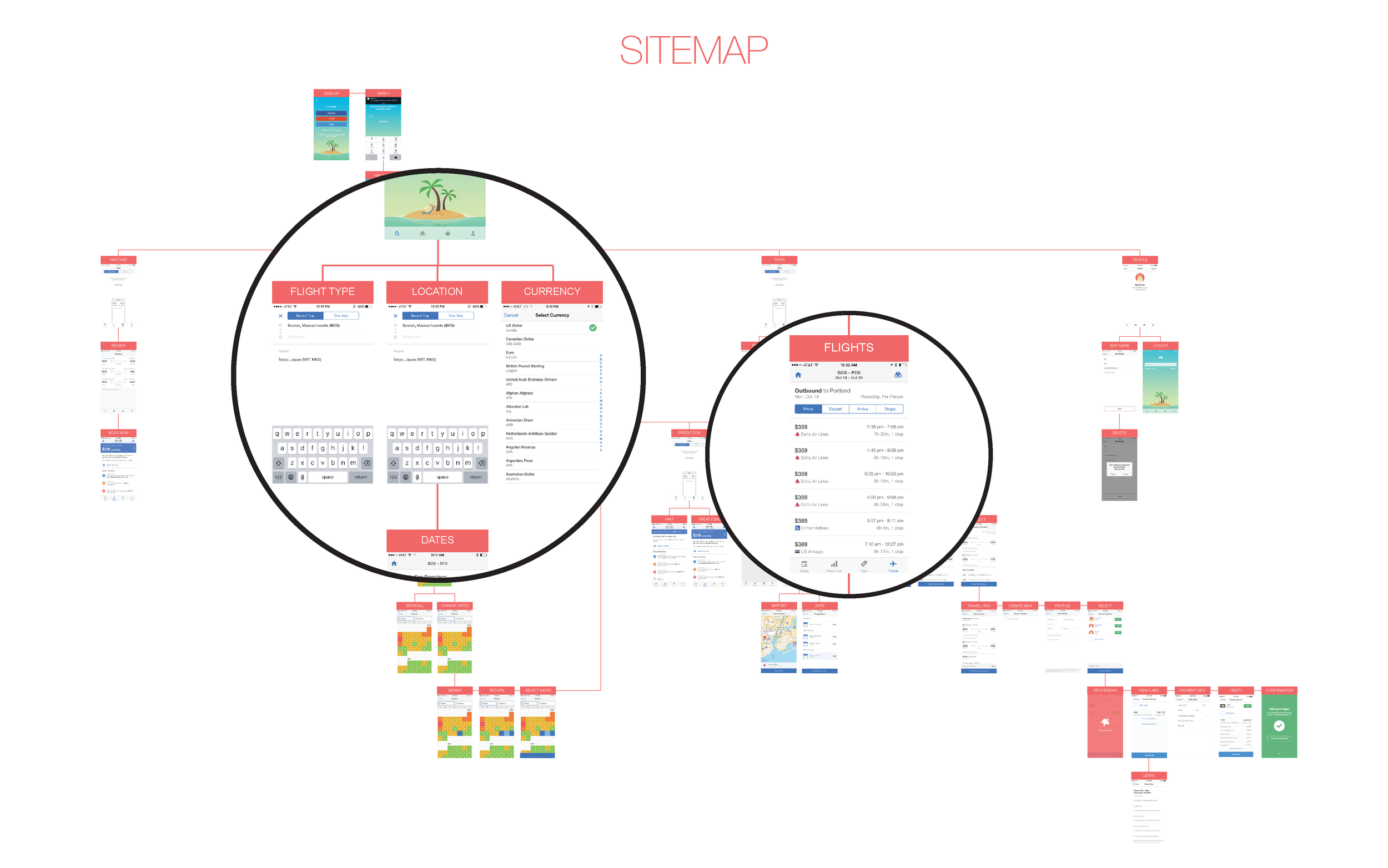
I quickly performed a qualitative audit by first creating a sitemap of Hopper. Creating the sitemap helped to hierarchically organize content and narrow the focus on any areas which needed further discussion or clarification. 

Hopper_Onsite-04.png

INSIGHTS

There were two primary locations a person could input flight information, the search screen and flight screen. Although, the focus of the project was to address the lack of flight filters, through the audit, several insights were uncovered in addition to the lack of search filters.

Minimal Search Filters

Unwanted flights were aggregated because there were no filters to sort user preferences of airlines, class, duration, etc. The lack of filters bogged down users who were searching for something specific. 

Redundant CTA's

Multiple call outs made it difficult to distinguish what actually did what. There is no clear hierarchy of copy or color to reference a certain action. 

Inconsistent Navigation Bar

When the user goes from the search screen to the dates, the navigation bar changes creating cognitive overheard. Also, the search screen is represented as a "home" icon and "magnifier" icon. 

Vacant Screens

There are many vacant screens waiting for the user to perform an action. Consolidation of some tasks would minimize empty spaces.

ANALYTIC REVIEW

Quantitative data was collected through customer research and sorted to find insights of what people really wanted in flights. I also considered unsolicited feedback of the app reviews and user complaints to help guide customer needs or general thoughts. The unsolicited feedback supported the quantitative data and generated the most passion when it came to features.  

JOBS TO BE DONE

I opted to use the Jobs To Be Done approach, instead of creating user stories or personas as a method to actualize features and filters. The exercise also helped to minimize features and filters that may not be as integral to the user. 

jobs to do-20.jpg

KEY INSIGHTS

Through customer research and planning, I identified users want an efficient experience that can accommodate their needs of finding the right flights. Search optimization should focus on helpful filters/features, better integration of watched flights and an uncluttered path to payment. 

COMPARATIVE ANALYSIS

A comparative analysis was conducted to see where current products in the market succeed or fail. It was a helpful way to benchmark interfaces, filters, features and user flow. I found many of the services offer significantly more filters, features and minimal steps to get to the flight listings.

COMPARISON

Creating a side by side comparison helped visualize where Hopper could add more features and filters. Just as important, it helped guide decision making on what features and filters could be removed. 

MoSCoW METHOD

After creating a comparison of features and filters, I employed the MoSCoW method to identify key components to integrate. This helped to create a product feature/filter roadmap to start building upon a MVP. 

DEFINE DESIGN PRINCIPLES

After compiling user research, synthesizing data and looking at reoccurring patterns, I established the design principles for future concepting and ideation. 

1. Standardize navigation bar:

- Reduce cognitive load
- Identify most important navigation screens
- Utilize primacy & recency principle

2. Improve flight search with helpful filters:

- Allow users to customize their flights
- Minimize steps to flights

3. Increase visibility of Hopper features:

- Update profile page
- Improve overlooked features
- Watched flights should matter

4. Optimize CTA’s

- Minimize redundancy
- Create visual hierarchy

IDEATION

After I conducted my research, I quickly started to iterate on various concepts and ideas. I then used my design principles to validate ideas for refinement. 

ideation-24.jpg

LO-FI WIRE-FRAMES

I created my first series of lo-fi wireframes and presented them back to Hopper. It was a great way to get my research in front of the team and discuss my thought process or any challenges I encountered. 

SEARCH SCREEN

This was the first iteration of the search screen. I created an "on-boarding" experience with several search filters e.g. class, passenger, multi-way and calendar. The existing screen only allowed the user to input location and one-way our round trip. Certain flight algorithms were useless because users couldn't specify details. 

FILTER SCREEN

The filter screen is accessed on the flights screen, for users who care more about finding the cheapest prices. This allows the user to pinpoint exact flights, while minimizing the content overload during the on-boarding phase.

PREDICTION SCREEN

The prediction screen is a crucial part of Hoppers app and notifies the user when the cheapest flights will occur. Unfortunately, once users logged into the flights screen, they no longer could access the prediction screen to remind them of the best dates to book travel. I combined the tips and prediction features on the same page, so users could get a quick snapshot of prices.

MOCK-UPS

Once I had solid design direction, I created hi-fi prototypes to begin user testing and gather feedback. I created several variations of the designs to observe user behavior of the flow and features. 

USABILITY TESTING

I conducted usability tests with many users, who frequently try to save money while booking flights, college students! I created paper prototypes and spent time going over the primary flow, while observing user interaction. Prototyping was an effective way to gain valuable insight into how users interface with the concepts. 

CHANGES TO THE APP ARCHITECTURE

Most of the new filters and features I designed lived within the existing app architecture. Almost all the users complained of the number of steps needed to get to the flights. As it exists now, Hopper iOS requires a whopping 6 screens before the user finally reaches the flights screen.

I also observed about half the users skip over the tab bar on the bottom of the prediction screen because they were trying to get to the flights section. Some did not bother to read the prediction screen, emphasizing the need to make it more recognizable. 

LESS IS MORE

I mapped out a primary user flow by consolidating some features and steps which were often overlooked by the users and reduced the existing 6 step process to 3. Not only would the streamlined flow minimize steps needed for users, but hopefully generate a higher conversion rate of search and pay for Hopper.

flow-47-47-46.jpg

Around this time, the exercise with Hopper concluded with the exploration of search filters. However, I still wanted to take an opportunity to address all the insights that were uncovered by the research and testing, through a reinterpretation of the Hopper app, just for fun. 

HOPPER RE-IMAGINED

FITTING FILTERS

The existing search screen only provided users with options of one-way and round trip. When the app generated flights based on search criteria, users had to sift through numerous flights that were irrelevant to them. 

The new search and filter options provide users the flexibility to custom tailor their search preferences. There is an on-boarding phase, which users input general information and on the flights screen, they can narrow down the flights based on their preferences through helpful filters. 

UPDATED CALENDAR 

The existing departure and return calendar only provides users with a range of low and high prices in a calendar view. The users see the best days to book, based on color coding but unfortunately there is still a big price discrepancy of $200 between each color range. 

The new departure and return calendar has been designed to allow users full price breakdowns of each day. In addition to the traditional calendar view, a graph view has been added to provide users an option to know the price down to the dollar.

ALL TOGETHER

The existing app created cognitive overhead by changing the navigation bar between screens. This led to features being overlooked and users missing out on valuable information because of confusion.

Now, the flights and tips are combined onto one screen that users can access by swiping up. They no longer need to tap an additional button to see flights.

replace-40.png

ERROR FREE

The existing app made users go through a series of flight screens to choose the outbound and return flights. If a person created an error, they had to hit back numerous times to fix their mistake.

The new interface of pop-ups allows the user to recover from an error. It also reduces the number of steps needed to access the payment screen. Hopefully, resulting in a larger conversion rate of search to purchase.

NOTIFY ME

Watched flights and Booked flights were on different navigation tabs requiring the user to constantly flip between the two to track travel. They also competed on the navigation bar, causing users to toggle unnecessarily between the tabs. 

Now they are on one screen and the user can be notified if any changes are pending to either watched flights or booked travel. This provides one destination for important notifications and also reduces the vacant screens seen on the existing app. 

COMPLETE PROFILE

The existing app lacks a comprehensive profile page. It only allows the user to enter a name, email, phone number and to log out.

The new profile page allows users to change important app settings such as notifications, currency, payment and gives users a way to communicate back to Hopper to send appreciation or suggestions for improvement.

RECAP

1. The navigation bar was consolidated from 4 to 3 CTA's. It also does not appear during flight searches to reduce cognitive load.

2. The watched flights and booked flights are merged to allow the user a quick glimpse at all the upcoming travel. It also becomes the home for new notifications.

3. The user profile has more than just name, email and number input

4. Flight filters consist of an on-boarding process and search process users can input more criteria to maximize search returns. 

5. The prediction screen has been integrated into the flights, to minimize user steps to choose flights. It also helps overlooked features become more prominent on a page that can be recalled by a button. 

6. The calendar has 2 search settings for better accuracy of prices and dates. 

Hopper_Onsite-27.png