Crimson Hexagon is a leading social media analytics company, offering key insights on campaign performance, competitive analysis and industry trends to brands, agencies, and other organizations.
Crimson Hexagon offers four products in its suite: ForSight, a deep dive analysis tool, HelioSight, a quick search engine on social, Dashboards, a real-time viewing product, and Reports, a report building and dissemination tool. As ForSight
To comply with my non-disclosure agreement, I have omitted and obfuscated confidential information in this case study.
ForSight application screens - March 2017
The Challenge
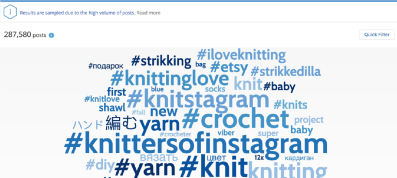
ForSight provides deep insights on consumer preferences, industry trends, sentiment, purchase intent, product feedback, competitors, and more.
We started the project because as Crimson Hexagon scaled as a platform, ForSight couldn't share components because it was built on Flash, while the other products used React. As we started to rethink the architecture, it gave us the opportunity to finally address a lot of the user feedback around discovery, better insights, robust filtering within workflow and updating the UI.
My Role
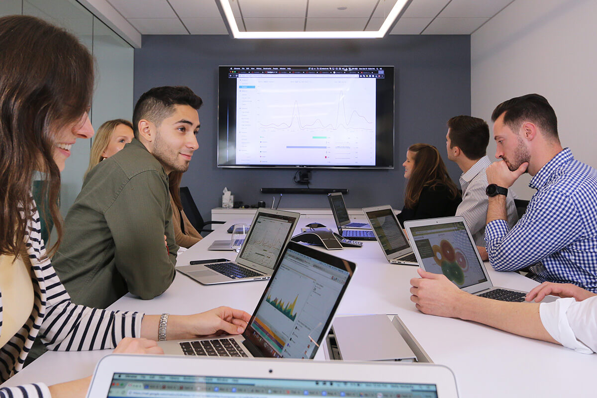
I led all design efforts of research, ideation, wireframes, visual design, prototyping, testing and production work for ForSight. I worked within a cross-functional team (pod) of Engineers (front, back and QA) and a Product Manager to define roadmaps, create user stories/scenarios and prioritize features.
Approach
At the outset of the project, one could be forgiven, if they assumed we'd redesign ForSight to look and behave like old ForSight, just updating it with React components.
However, because this was a great opportunity to redesign an old platform, I wanted to critically look at how people were using the product and find areas we could add significant value.
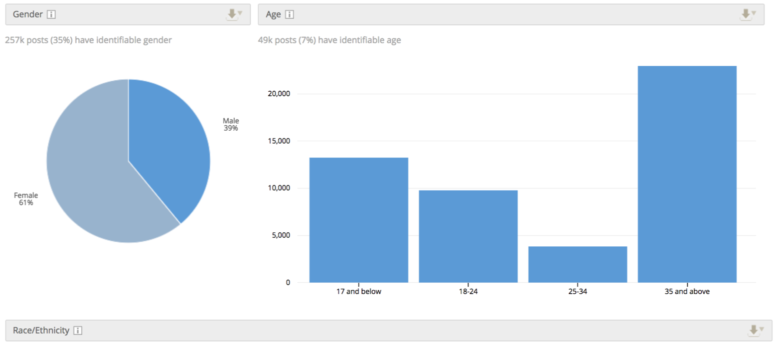
I decided to conduct contextual inquiries with 7 analysts (users) and document general observations, hear what they do, and gauge their preferences of what they thought worked or didn't.
Insights
A lot of great insights were provided by the analysts and to make sense of all the information, I was able to cluster the insights into 5 themes. The 5 themes were also used to create some preliminary Jobs To Be Done statements to help frame the issues.
1. Better UI and data viz
- Custom visualizations for client related quiries
- Integrate outside analysis tools

2. Time to train on platform
- Intuitive navigation
- Faster, simpler, smarter set-up of monitors
3. Understanding of story
- Clarity of the story and insights
- A more natural way to parse data
- Telling the story to non-analysts

4. Iterative search and edit
- Integrated workflow (cycles between edit and results)
- Comparisons within and between monitors
- Bulk editing and filtering
5. Monitor management and organization
- Easy access, editing and previewing of existing monitors.
Deeper Analysis
While some of the findings were consistent with previous feedback, we were curious to probe deeper on "Insight 4" - Iterative search and edit. We hypothesized time to train on platform and understanding of story could be directly addressed by designing for "Insight 4" and thinking of a differentiated user flow of editing, filtering, and seeing results.
I created a user journey to help aid in the discussion of what analysts do, think, feel, etc. while they use the product. Users stated the iterative process of discovering insights is the most tedious and most frequent task they perform because of how they explore the product to uncover insights.
The Discovery
After the walkthrough and user journey, we quickly learned the primary use case was designing for users who click into a peak and are curious to know what is driving the conversation. Often times, users will cycle through this process up to 10 times in order to get a better sense of the conversation.

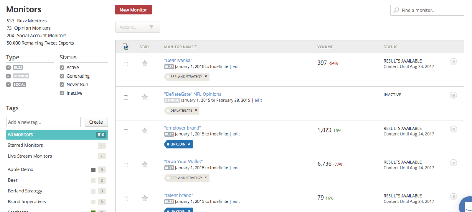
I also created a sitemap of existing ForSight and worked with the PM to retrieve 7 months worth of data to see what tools analysts used the most in the product.
I was also able to get analyst feedback of why they used the tools, importance of use, frequency, etc.
The combination of qualitative and quantitative data helped inform decisions of what tools should be supported, improved or potentially deprecated in the redesign.

IA Redesign
Once I compiled all the data, created several taxonomy structures, conducted open and closed card sorts, tested with users, we finally arrived at a more streamlined flow of what users said they wanted. Creating the IA also helped with communication with engineers and they began developing the mainframe of the system.

The overall structure consolidated like actions and reduced the amount of tabs in the header and primary navigation. Below are some of the key concepts that drove future direction on navigation, structure, workflow, etc.
Iterative Testing
I conducted usability tests over the course of the define/ideation phase to gauge preference and user behavior. Tests were conducted weekly with a minimum of 5 users each session. The tests incorporated a combination of task analysis and preference (a/b testing) to gauge user reaction and measure the success or failures of new concepts. Below, are samples of the many concepts created to test such things as: navigation, new page structure, drill-in and filtering.
New navigation structure
During initial inquiries, users claimed the existing navigation felt "clunky" and was disorganized. We wanted to know if it was truly a navigation issue or was it a content hierarchy issue?
Our first attempt to address the challenge was to look at different ways users could navigate through the product. I laid out the same content in different schemes and we were able to gauge discoverability, speed and preference.

Top Navigation
Users preferred the top navigation layout because it allowed for bigger charts and visualizations. They also like the new architecture of the tab structure.

Side Navigation
Users liked the side navigation because it was a familiar navigation scheme but they preferred the top navigation because it "was easier to navigate and appeared cleaner."

Side and Top Navigation
Users disliked the side and top navigation because it created too much load for users going from side to top.
Useful summary page
Users complained the summary page didn't provide a lot of helpful information, despite it being the first page users saw for results. They contested the charts were too difficult to understand or didn't provide enough information to prompt wanting to dive deeper on a specific insight.
We attempted to strip out the content users didn't look at like spark lines, multiple volume graphs and provide clear natural language instead of just numbers. Our goal was to create "true summary" page users could use as a launch pad to discovery, instead of something they overlooked.
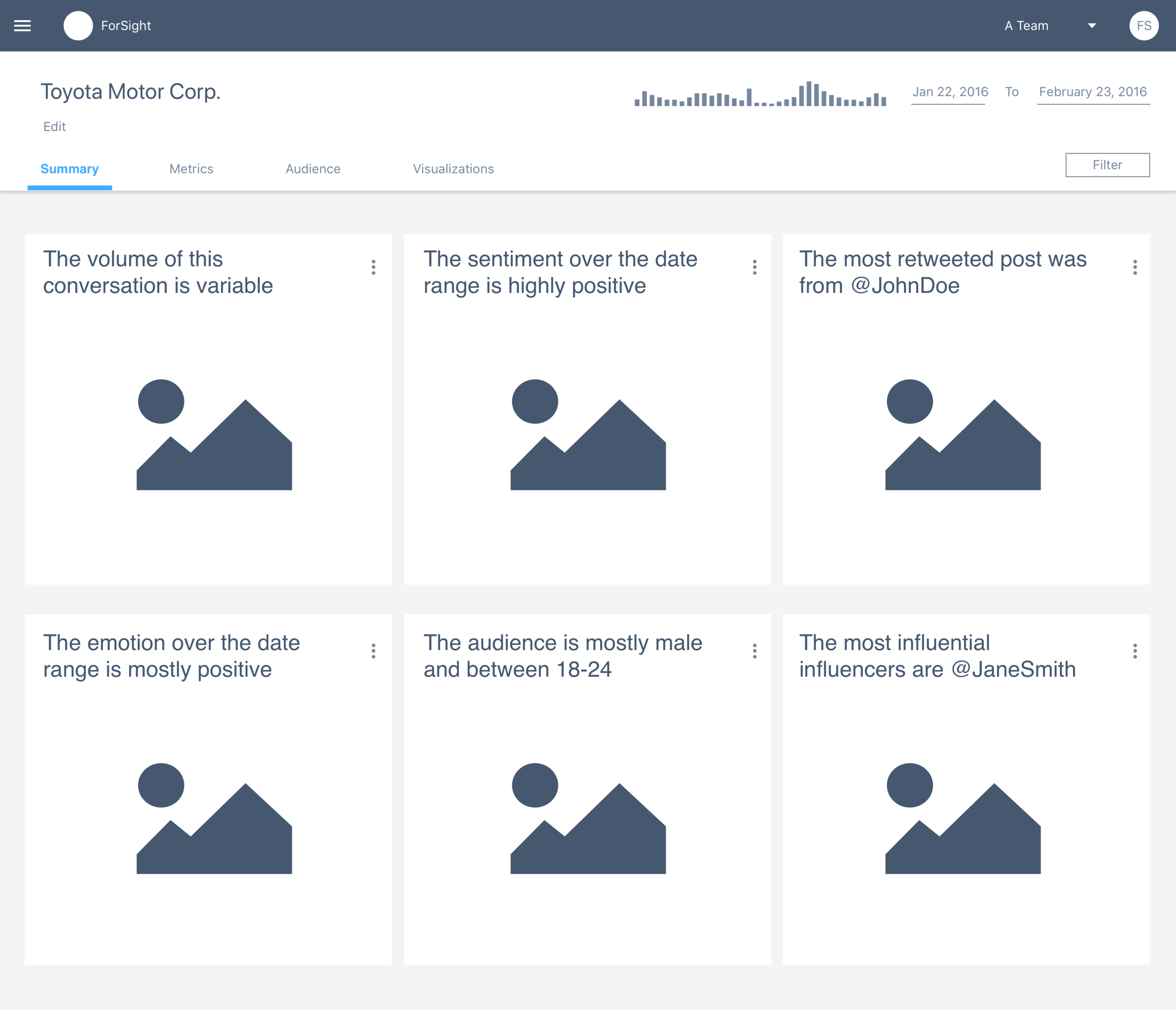
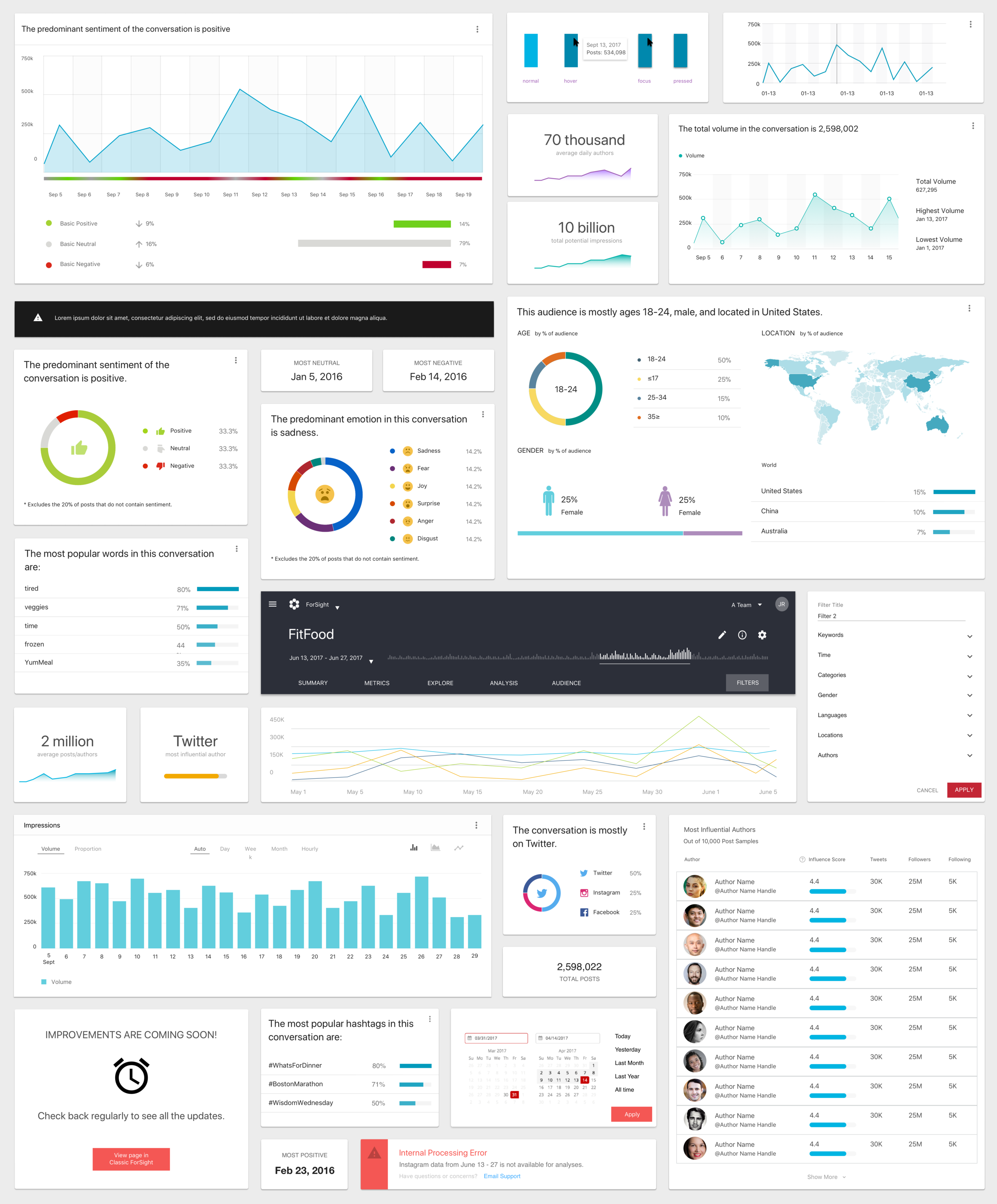
Cards
Users preferred a simple card layout that summarized the most commonly used metrics within ForSight. This was an easy way for users to distill the overall conversation.

Cards and Post List
A suggestion from the PM was to incorporate a heavily used feature called post list on the summary page. The post list provided detailed information about a metric. Users found this helpful but had too much detail for what they thought a Summary Page should show.

Call Outs and Graphs
Another concept incorporated more detail charts on the summary page. Users thought the summary page was getting too busy and wasn't as easy to understand as just a simple card layout.
Seamless drill-in experience
Most users spent the majority of their time on the platform clicking into a peak(s) and looking at results of why it spiked. They mentioned how tedious it was because they would do it often, but it was necessary in order to find out what was driving the conversation.
While we weren't out to change the paradigm of clicking into something to learn more, we sought to enable users with a more robust discovery method. We hypothesized the tedious nature of search/discovery could be reduced by introducing a more integrated drill-in experience of results and tools.

Scroll
Users preferred this interaction behavior because it greatly improved their workflow. The scroll allowed users to quickly view the graph and drill into details while enabling a quick scroll up to view the content.

Modal
Users liked the modal interaction because it was a familiar pattern they recognized from old ForSight. The trade-off for users became losing context to what was underneath the modal after an extended period of time and an explicit click target to close the window to get back.

Tab
A tab drill-in experience was explored to help clean up the navigation of ForSight. Since users would spend a lot of time on the chart and look at details, having to click back to the chart after navigating to the detail view was very time intensive and something users hated.
Filtering
A big part of search/discovery is the ability to filter. Users would often create "quick filters" to refine search and once results were narrowed, they would create a "global filter" that could be saved.
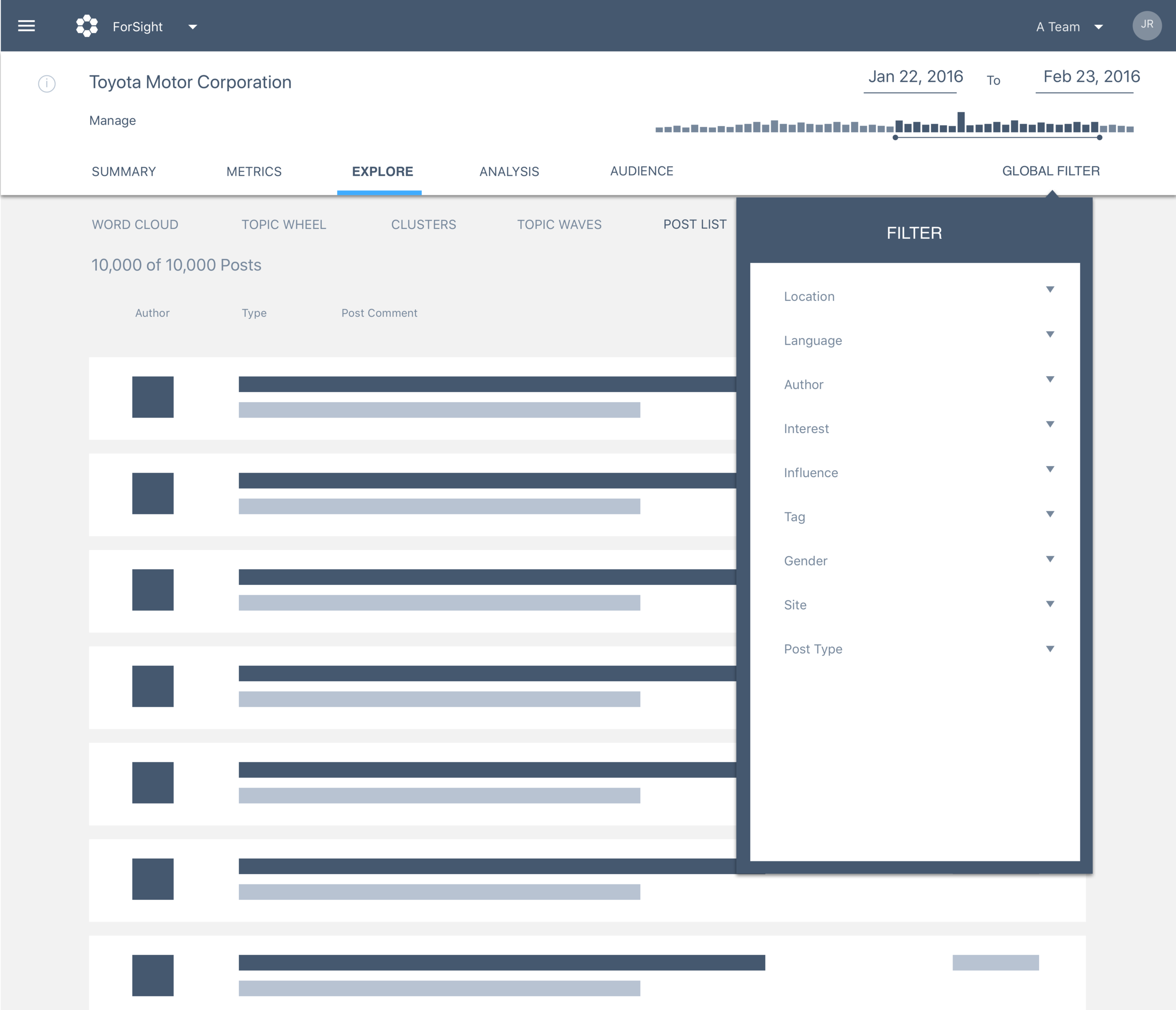
Global
Global filters were created by users who recreated their search filters from earlier exploration. We explored an option to allow users to save a filter from their search to expedite the filtering process.

Drop Down
We explored more robust product level filtering that would help users narrow results quickly. The large benefit is the ability for users to create global filters from a local filter.

Right Rail
Users liked the idea of filtering being constant on the right side. However, upon showing the concept to engineers, we couldn't do it because of the behavior of global and local filters.
Refinement
In parallel of designing the core UX, I also worked along side another designer to refine the UI of the product. We created numerous concepts to A/B test with users and I also worked with developers on defining the behavior of a graphs, charts, colors, etc.
Below is just a small sample of medium to high fidelity prototypes that were created.
Final Design
After rounds of testing, validating assumptions, pivoting direction, pixel-perfect specs were generated for build. Below are some of the key screens that addressed issues of navigation, content, drill-in and filtering.
Summary Page
The summary page now has 5 distinct cards that were most frequently used within ForSight. Each card provides a snapshot of the conversation related to each section. Natural language is used to denote the most important metric but visuals also help to support what's on the card. Users also have the ability to export cards into reports and configure them based on preference. Finally, when a user clicks on card, it sends them to that metric instead of the user having to search for it.

Metrics_Volume
The metrics section is where users will spend time to find out why a certain spike happened. Once they click into a peak, the post list is shown where they can read comments from social media. They can scroll to the graph to select another date and no longer have to close a modal every time.

Filtering
To aid in the workflow of searching and filtering, explore tools on the top right are now available to help refine search. Users can now explore different visualizations within the scroll section and customize results with the new filter function. Finally, if users have narrowed a search to their preference, they can save it in the explore section.

Better Analysis
To aid in the workflow of searching for insights, heavily used lists have now expanded to show more topics and like items have been grouped together instead of being separate.

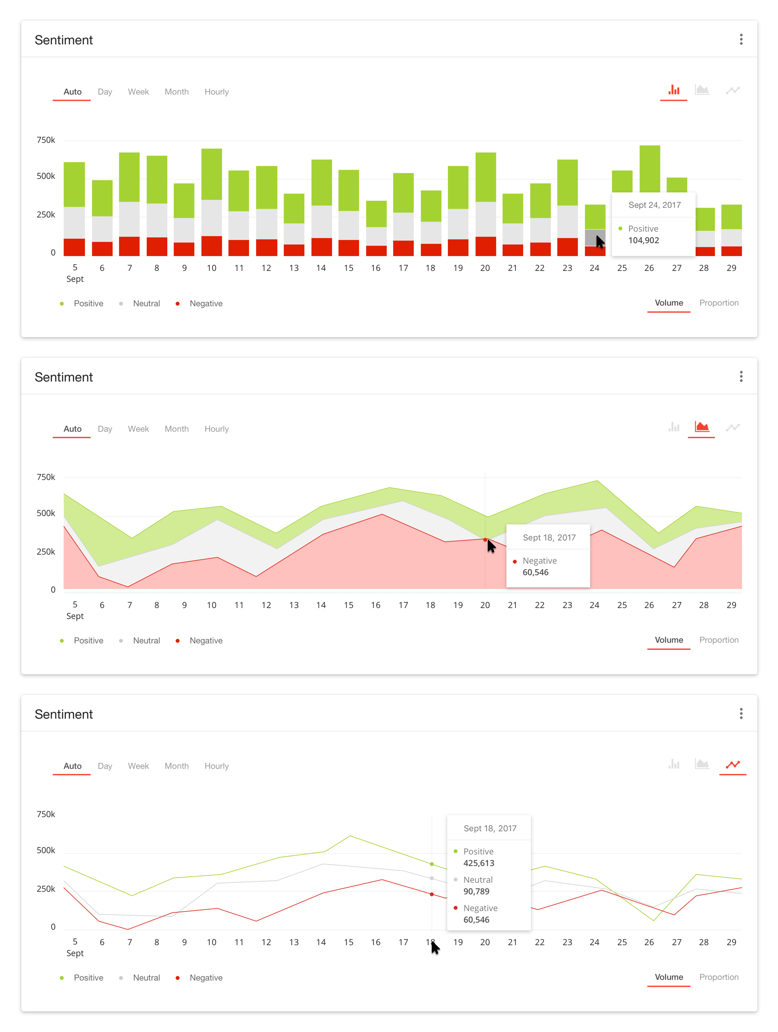
Charts - bar / area / line
Many new charts were created to support the redesign of ForSight. The great news is they can all be shared and reused within the Crimson Hexagon Platform. I defined the rules and logic of the x&y axis as well as hover states so users get the most out of the data visualizations.
Results
The redesigned ForSight had a beta release to existing customers and the reception was great! Full release is expected early 2018, as there are still a few screens that need to be built.
We learned 91% of people preferred the redesign over the old design and they'd use it as their primary tool going forward. Conversion has been slower from switching to old to new but that's because users stated they need the full suite of tools in ForSight and it's cumbersome to toggle between the two.
Early tracking is positive as there's been a significant bump in time and exploration people spend in new ForSight week over week.
Recap
I redesigned an existing enterprise level SAS application from inception to launch.
I led the design effort by conducting interviews, surveyed users for quant and qual data, created user journey, mapped flow charts, redesigned the IA, defined Jobs To Be Done and conducted usability sessions.
I designed and iterated numerous times based on user feedback
I collaborated with another designer to help craft the visual brand identity of the new product